Peloton
Helping Peloton owners leave more useful reviews
Fewer than 1% of Peloton customers were leaving a review after buying hardware. As product designer and feature lead, I redesigned when members were asked and how the review form worked.

Context
Engaged owners, almost no reviews
Fewer than 1% of customers left a review after buying Peloton hardware. Reviews act as social proof for people deciding whether to buy, so the gap mattered.
Other data showed that customers were highly engaged and satisfied with their products. If people were happy and using them, the problem was more likely to be how and when we asked.
I was the product designer and feature lead on the review submission redesign, working within a global cross-functional team across several locations. I led the submission experience; research, build and the reviews page were shared work.
We set two goals: more completed reviews, and more useful, structured feedback that answers the questions buyers have.
Timing
Asking during early ownership
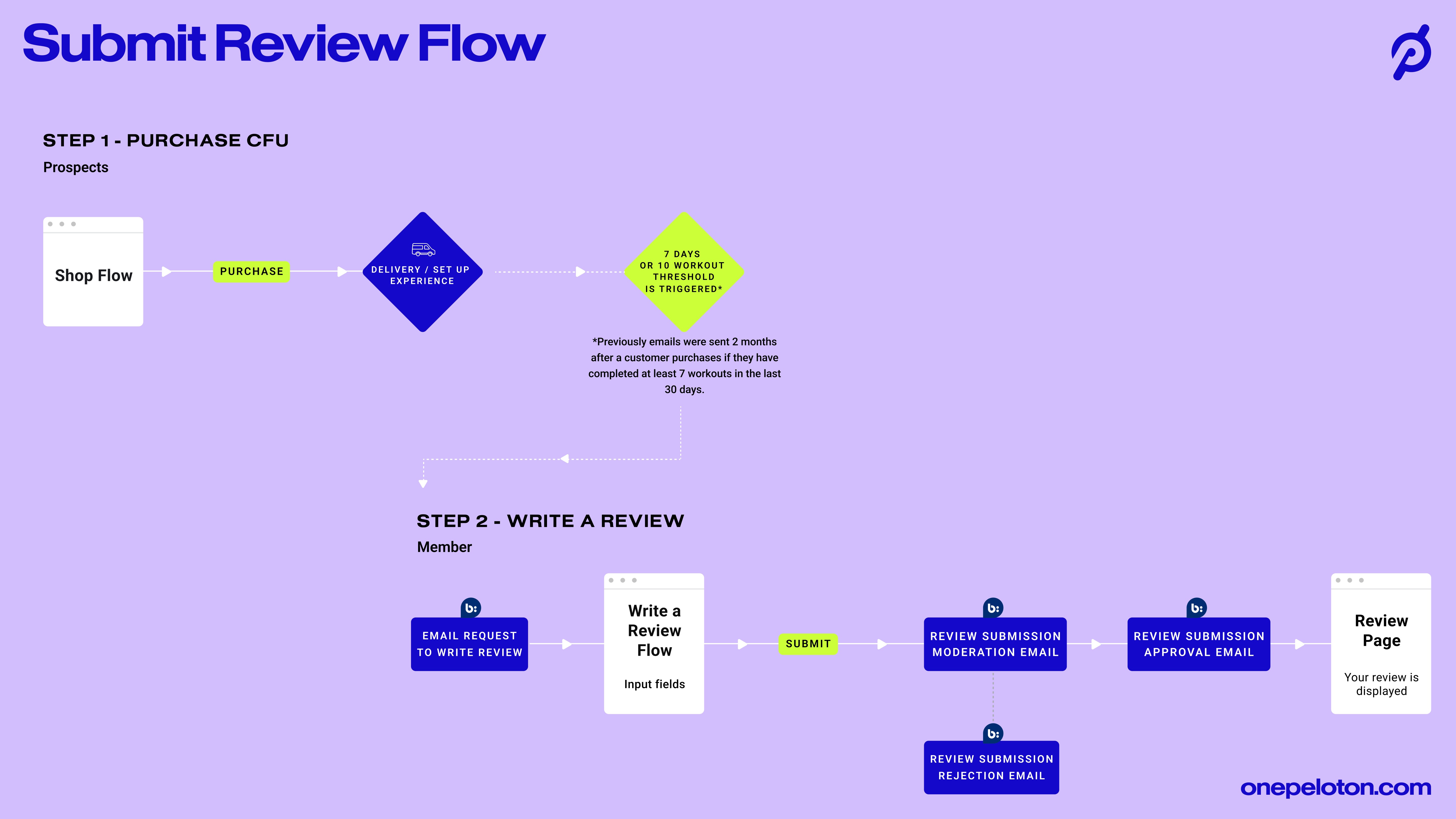
The previous review request arrived around two months after purchase.
The redesigned flow brought the request forward to the earlier of two signals: seven days after purchase or ten completed workouts. Timing was one part of a wider redesign, so the result at the end of this study belongs to the redesign as a whole rather than to timing alone.
Review form
Rating first, personal details last
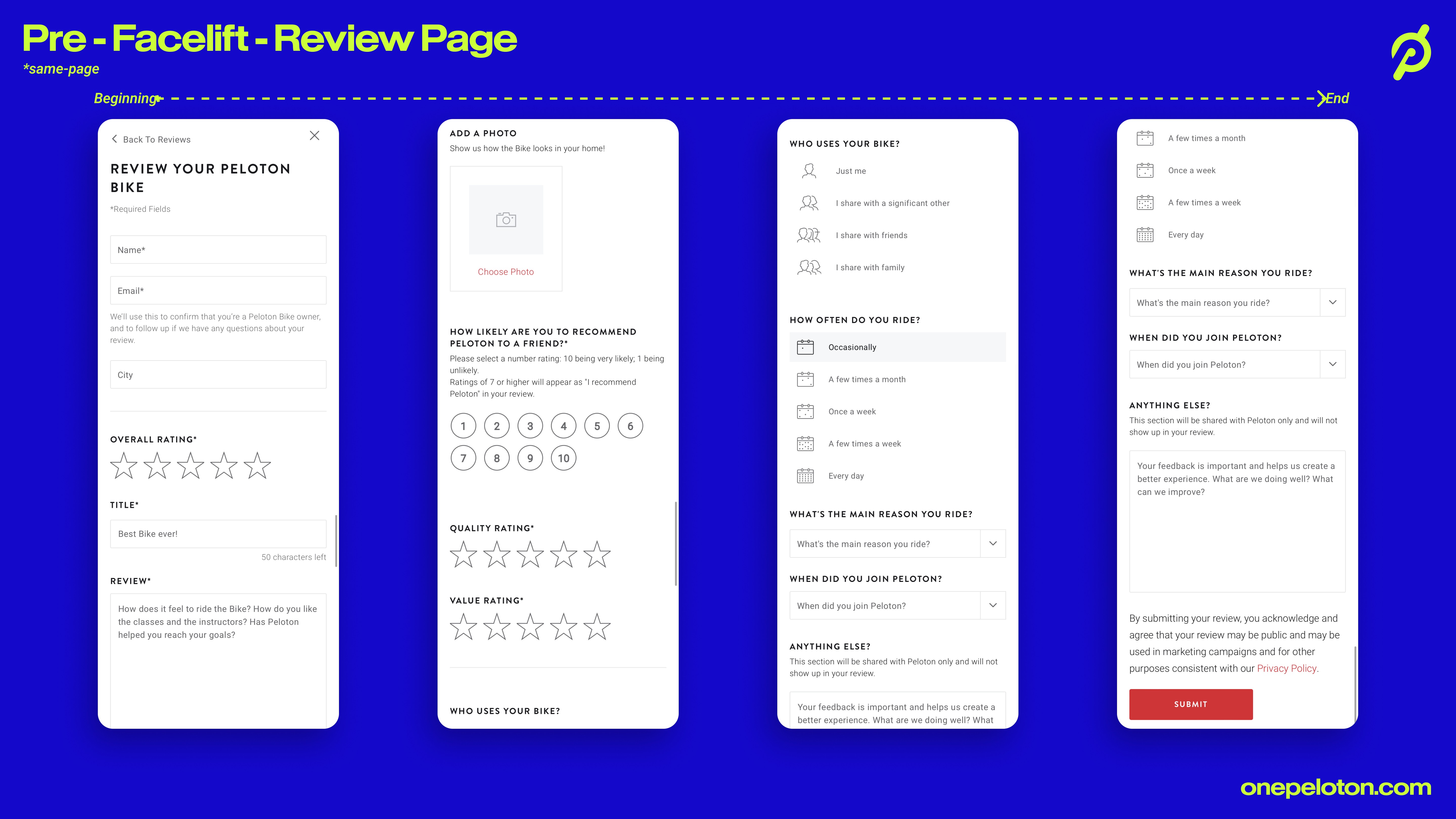
The old form was one long page. It opened with name, email and city before asking for a rating, then mixed product ratings, a recommendation score and questions about how people ride.
Before designing, we examined review flows from Amazon, Airbnb and comparable products, and went through existing support feedback and abandoned reviews. Moderated and unmoderated research then informed the redesign, including sessions with 10 members in the US and Canada on mobile and desktop.
The first change was to open with a star rating. It gave members an easy starting point before we asked for personal details or written feedback. Participants responded well to it, and for returning customers we filled in what we already knew from their account.
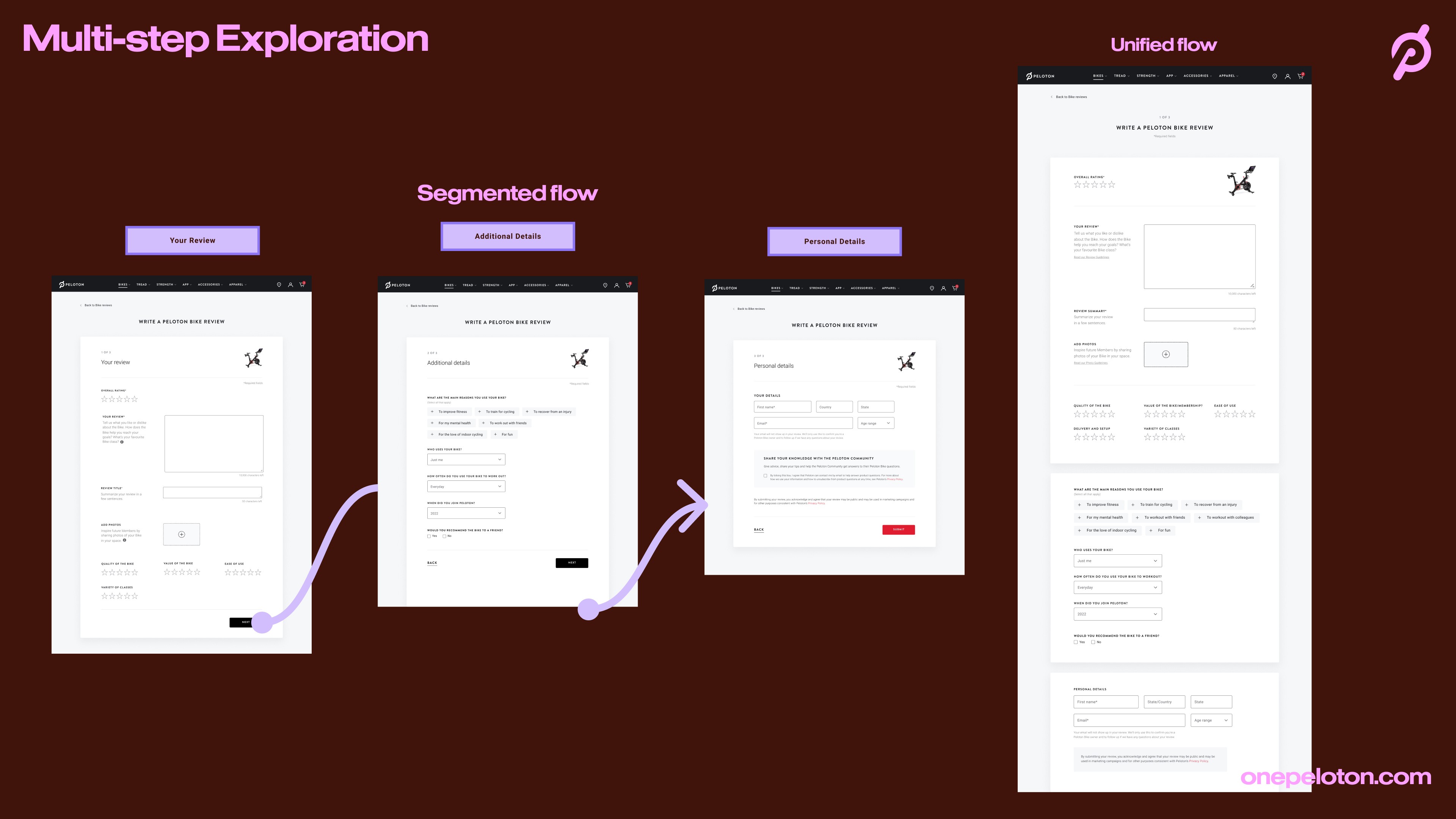
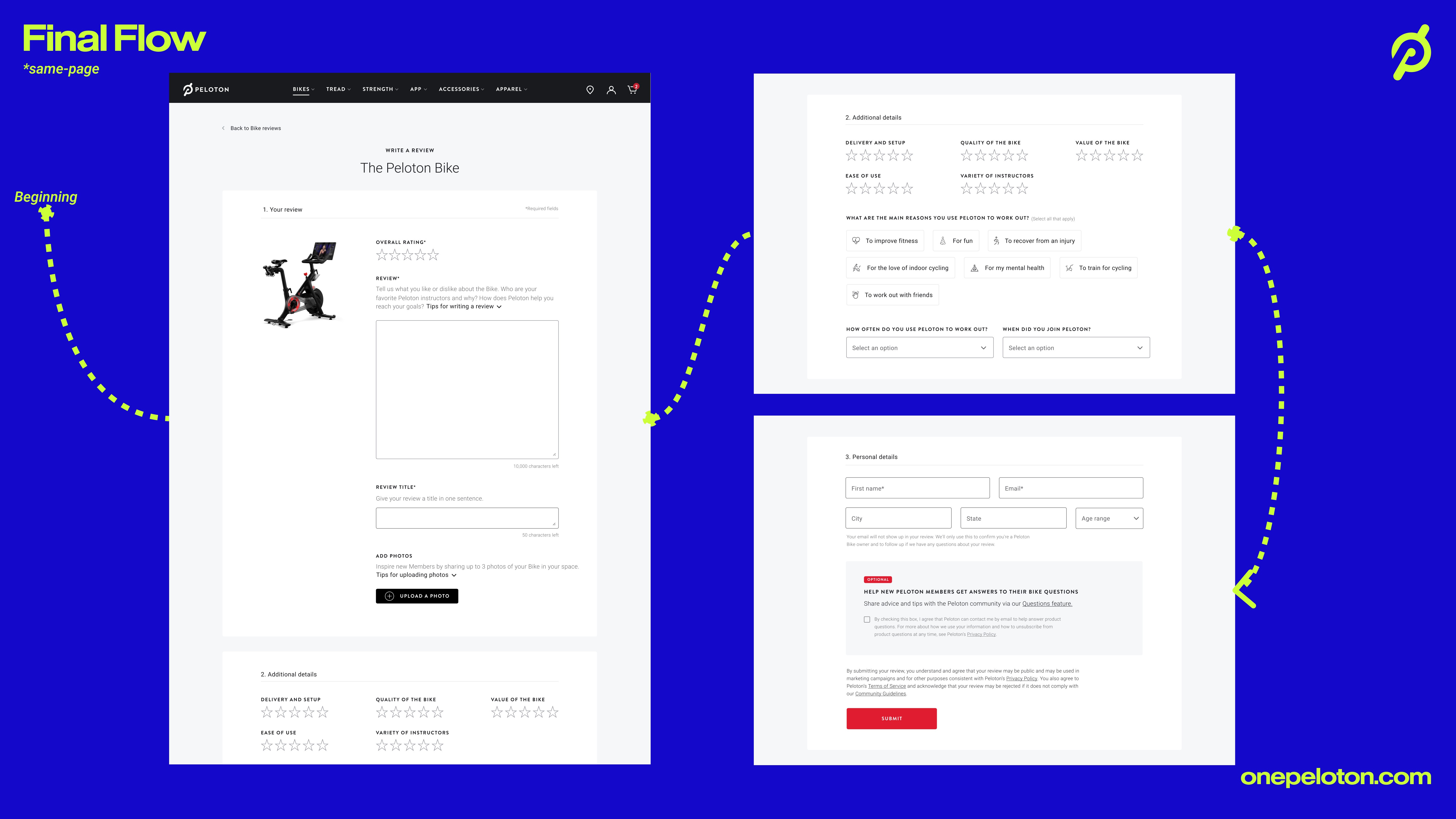
We then tested a segmented flow, with separate steps for the review, additional details and personal details, against a single page. The single page felt simpler and more direct, with no moving between sections, so that is the flow we built.
Ratings
Detail that helps the next buyer
Familiar 1–5 ratings captured feedback across specific areas: product quality, value, ease of use, variety of classes, and delivery and setup.
We considered three scales. A visual analogue scale risked being too complex, and a Likert scale offered more nuance than people needed here. We chose a 1–5 star rating because it is simple and familiar.
On the reviews page, the ratings appear as an average for each area. Because every review now carries the same categories, the feedback is structured by design, easier for buyers to compare and for the product team to read.

Why do you ride?
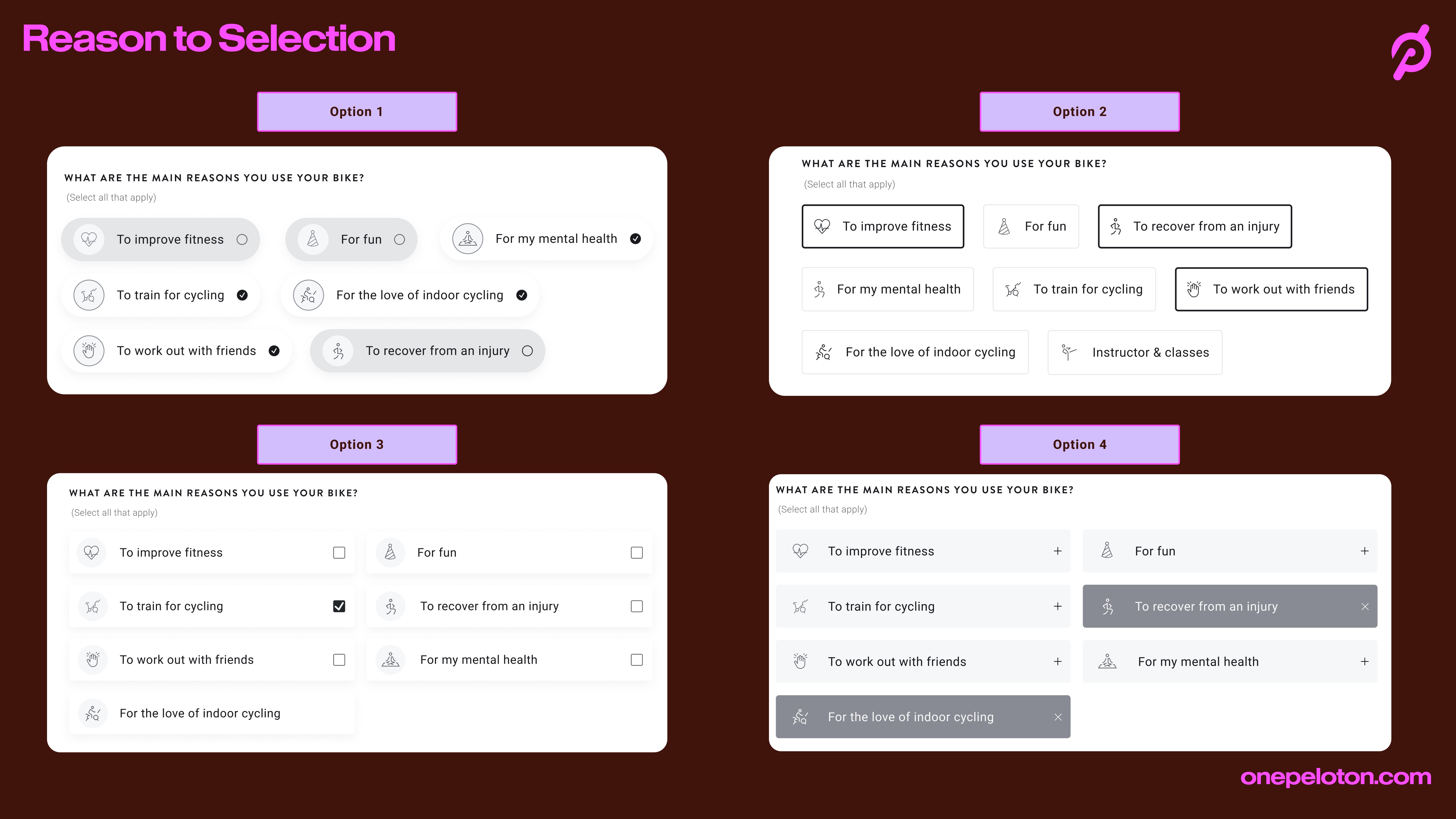
We also asked members why they use their bike, with options such as improving fitness, mental health, training for cycling, working out with friends and recovering from an injury. We explored four approaches before selecting the simplest: a multi-select set of tags. The accordion version, with “+” symbols, made people expect more categories to open.
Some participants first saw the question as serving Peloton’s data needs rather than their own. Once they understood it, they valued being able to say why they ride.
Photos
Making photo uploads feel safe and worth doing
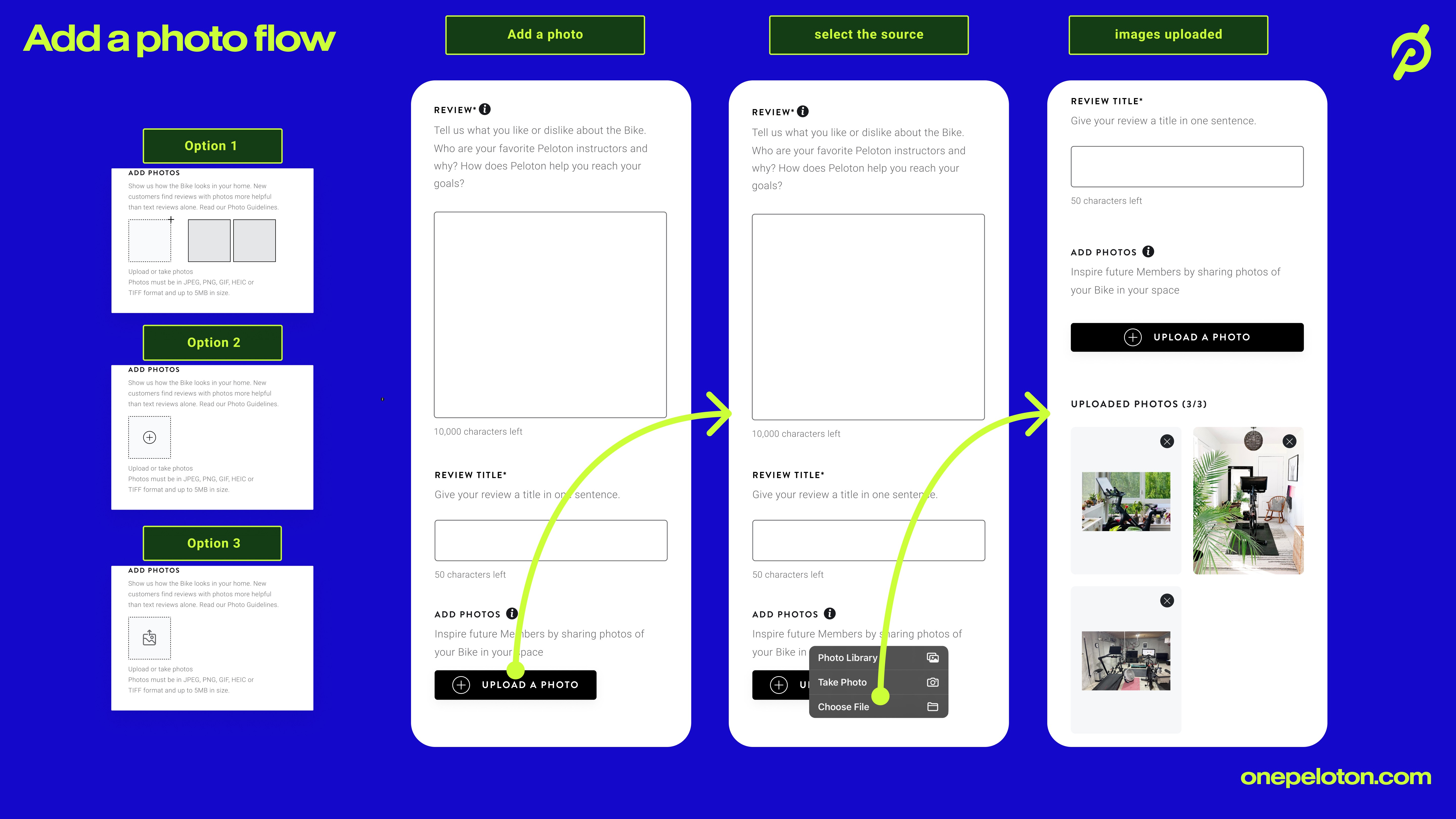
Photos make reviews more credible and show what the product looks like in real homes. The guidance had to encourage useful images while addressing privacy concerns, so we brought the upload option into the early part of the form.
Testing surfaced three hesitations. Some people were self-conscious that their workout space didn’t look like the polished images on social media. Others wanted to know how their photos would be used. Desktop users found uploading awkward.
The form encouraged real spaces over polished ones, explained clearly how images would be used and suggested uploading from a phone. We also explored letting people save their progress and switch devices part-way through; that remained an exploration.
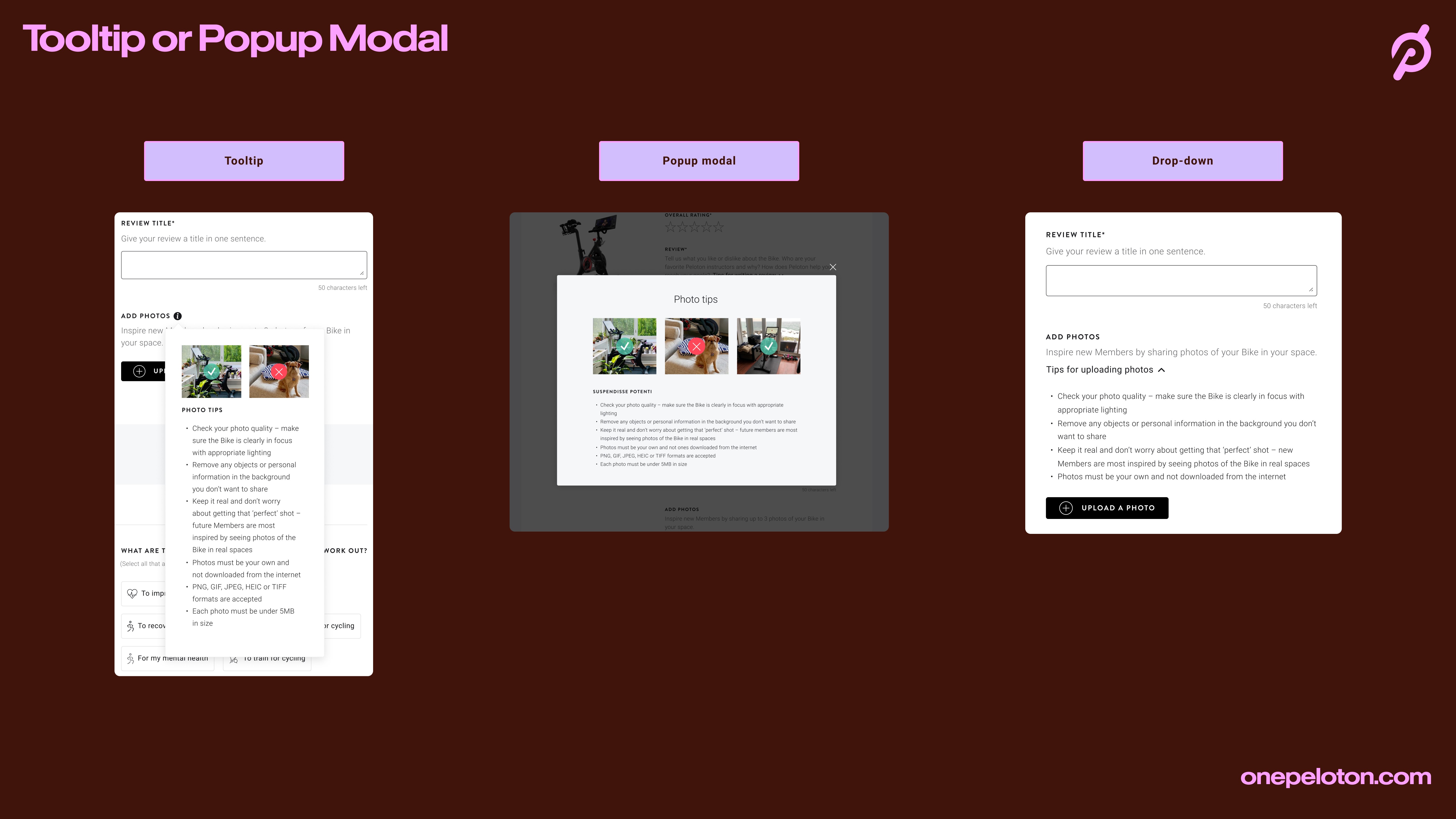
Where the tips should live
Photo tips needed to be available without getting in the way. We compared a pop-up modal, a tooltip and an optional accordion. The modal interrupted the flow and a tooltip could easily be missed, so we chose the accordion. Members open it when they want guidance on clear, well-lit photos, showing their real space and protecting their privacy.
The final form brings everything onto one page in three parts: your review and photos, additional details, then personal details.
Result
What shipped and what changed
Completed review submissions increased by 50% in the first month after launch.
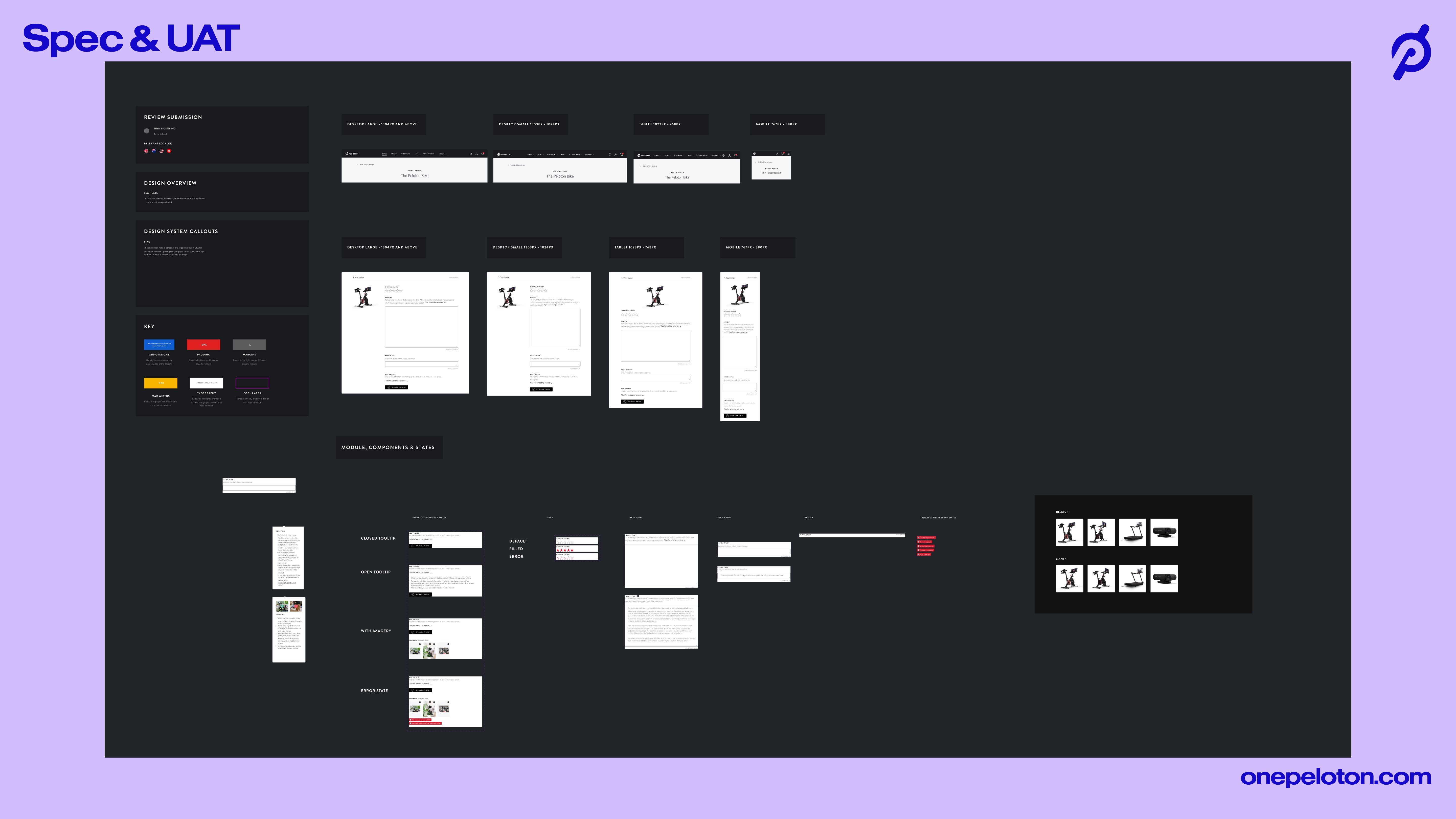
What shipped: the earlier review request, a rating-first single-page form, 1–5 ratings for each area shown as averages on the reviews page, the multi-select question on why members ride, and photo uploads with optional tips in an accordion. Saving progress and switching devices remained explorations. The specification and acceptance-testing board below documents the final modules, components and states.
What I took from it
The most useful early signal was the mismatch between high engagement and almost no reviews. It pointed us at the request rather than the product.
Testing also showed how quickly a helpful question can read as data collection. Members came round once they saw the point of it, so the reason for a question needs to be clear before the question itself.


