Kliq
Replacing Kliq’s demo call with self-serve onboarding
Every new Kliq creator had to complete a call before they could start building. Across three iterative releases, I led the design of a self-serve route from sign-up to publishing.

Problem
Every creator had to wait for a call
Kliq lets creators build an app or web space for their community and earn from it straight away. Yet every new creator had to complete a mandatory onboarding call before they could start, and the wait for that call was three to five days.
The call held people up at every stage. Four in ten booked calls were no-shows, and support spent more than half its week repeating the same walkthrough. Growth had stalled, and creators came away thinking Kliq was a done-for-you agency rather than a platform they could use themselves.
My role
I was Lead Product Designer from October 2023 to February 2025, working with one product manager and four engineers. I led the design across three iterative releases, covering benchmarking, user flows, prototypes, testing and iteration. Building, releasing and measuring each version was shared work, and the results in this study belong to the team.
The question we set ourselves was how a new creator could go from signing up on our website to a live, paid space on app and web without anyone holding their hand. If that worked, we could grow sign-ups and keep support time for the cases that needed it.
Groundwork
Fixing the console before building a funnel
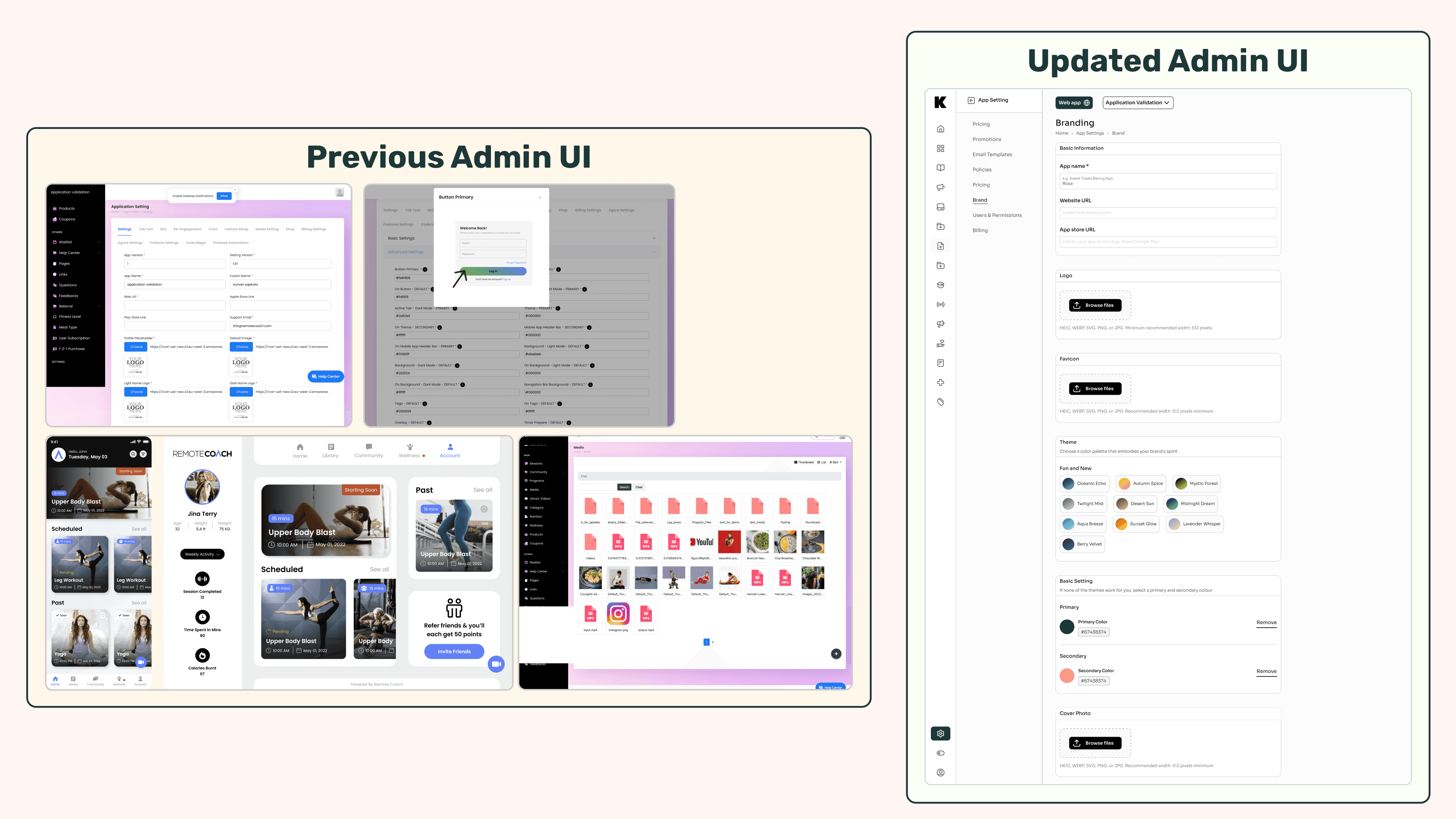
Kliq began as RemoteCoach, a tool for personal trainers. When the platform opened to every kind of creator, the biggest obstacle was our own admin console. Screens were cluttered and inconsistent, tasks such as uploading a logo or setting a price sat three clicks deep, and new users arrived and asked, “Now what?”
Any self-serve flow would have dropped people straight into that console, so we rebuilt it first. We kept the features trainers relied on and brought the interface in line with the new brand.
What the new flow had to do
A creator should be able to sign up on the marketing site, find their way around a guided console and publish real content without booking a call. We agreed five minimum requirements: a setup guide on the first visit that stays one click away, a progress meter that stays visible, the freedom to skip and come back later, one-click sign-in, and a clearly marked “Most popular” plan.
What we aimed to change
We set three success measures at the start. These were targets, not results: 70% fewer pre-launch calls, 60% fewer week-one support tickets and a 60% increase in onboarding completion. What the team achieved is reported separately, release by release.
Research
Borrowing proven patterns so testing could focus on Kliq
I studied ten products that already made sign-up and onboarding feel easy: Shopify, Printify, Gelato, Linktree, Notion, SpreadConnect, Wix, Figma, RPC Fast Pricing and Canva. For each one I collected screenshots and teardown notes and scored it against a short heuristic checklist.
Five patterns kept coming up: a welcome dashboard with one clear next step, a progress bar that frames the journey, a prominent “most popular” plan, inline tooltips instead of help articles, and one-click Google or Apple sign-in at the very start.
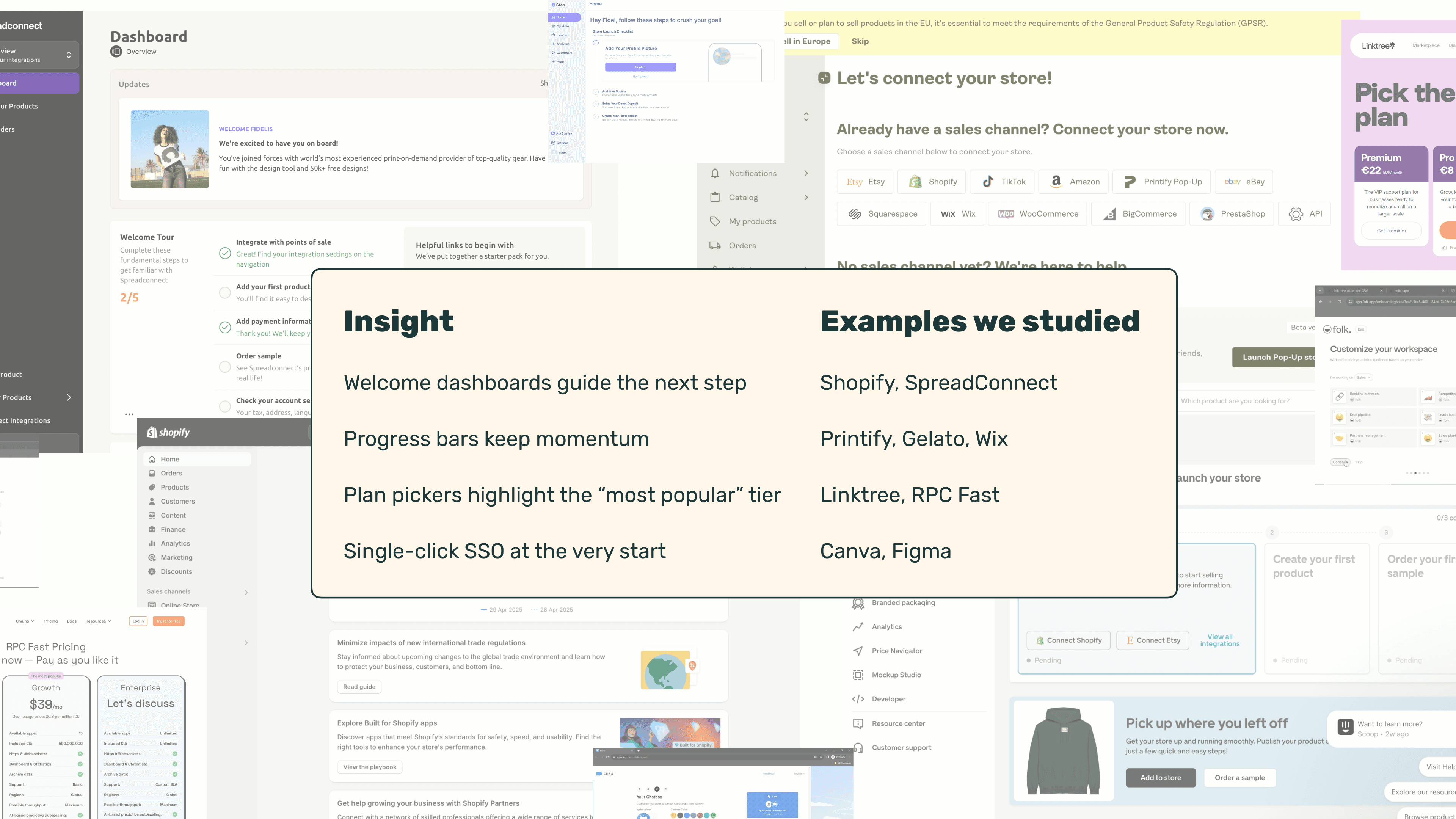
We turned these into a rule: every concept had to use at least four of the five. Anchoring the flow in familiar patterns reduced guesswork and let us spend testing time on the parts that were specific to Kliq.
How we worked
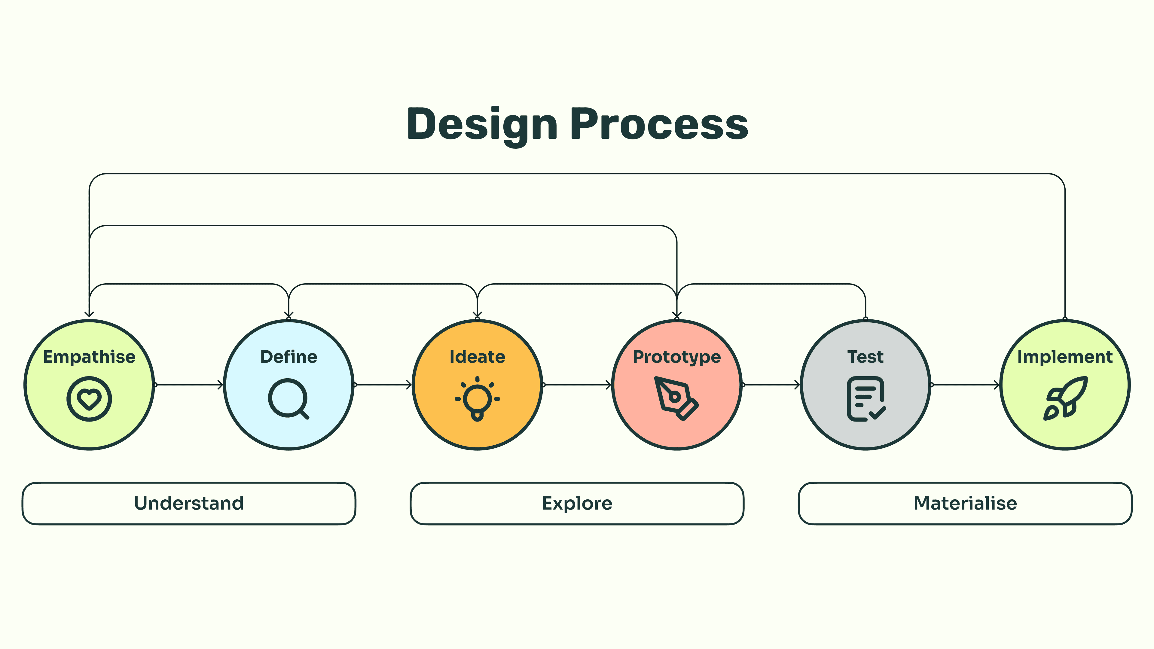
Conversion was the measure that mattered most, so we worked in two-week loops rather than a single pass. Each loop moved from Figma click-throughs to acceptance testing with developers and a five-user Maze session to catch usability problems, then a release behind a feature flag. For two weeks after each release we watched Hotjar click maps and Looker funnels, and later added creator interviews, Hotjar recordings and support-ticket themes before choosing the next hypothesis. Design-system tokens were updated after every release to keep the interface consistent.
Release 1
A zero-call journey, live in 14 days
I sketched three candidate flows with our product manager and engineers. We chose the one that used every proven pattern and could be built within a single sprint, because real data from a working release would settle more than further debate.
The flow had two parts. Self-serve checkout took a creator from basic details and consent, through choosing a creator type and a plan, to payment and straight into Admin Home. Guided onboarding inside the product then asked them to set their look and feel, connect Stripe, create a subscription tier and upload a first programme. Once the checklist was complete, the Publish button unlocked.
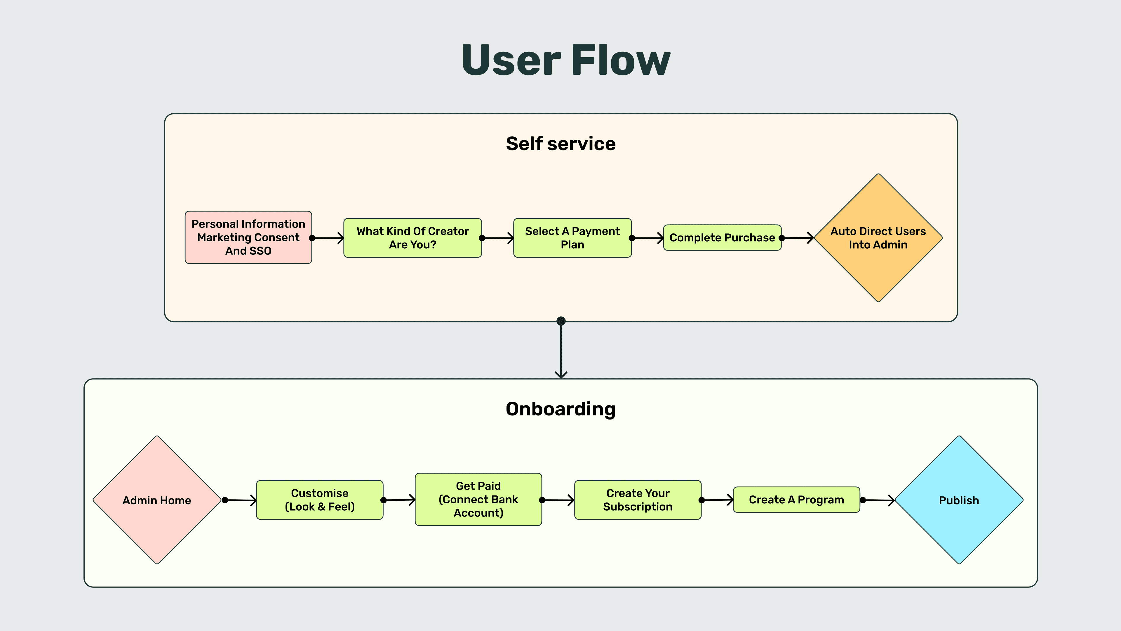
Decisions on each screen
Sign-up fitted on one page, with Google or Apple sign-in and an email fallback for edge cases. If someone chose email, we asked only for a name and password.
Creator-type tags such as Fitness, Cooking and Podcasts took a second to answer and let us prepare styling suggestions later.
The plan picker showed three tiers, with Professional labelled “Most popular”, as in the plan pickers we had studied. Payment offered a promo code first, then Apple Pay, Google Pay or card, and a green progress rail showed creators where they were throughout.
A two-second “Setting up your space…” screen made the move into Admin feel deliberate rather than abrupt. The welcome dashboard put a four-step quick-start checklist front and centre and greyed out tasks as they were done. Tutorial videos and an FAQ sat underneath, so help was visible before anyone needed to contact support.
This version used four of the five patterns and needed no deep back-end changes, which kept it within one sprint.
Iterations
Following the drop-off through two more releases
What the first release showed
Two weeks after launch, sign-ups were up 12% and support tickets were down 67% compared with the call-based journey. But only 6% of new creators had published within 14 days.
Hotjar showed a heavy drop-off immediately before payment. Our first assumption was price, but a second look at the benchmark showed that nearly all of those products offered a free trial. Our hypothesis became that creators were not ready to pay for a new platform they had not yet tried.
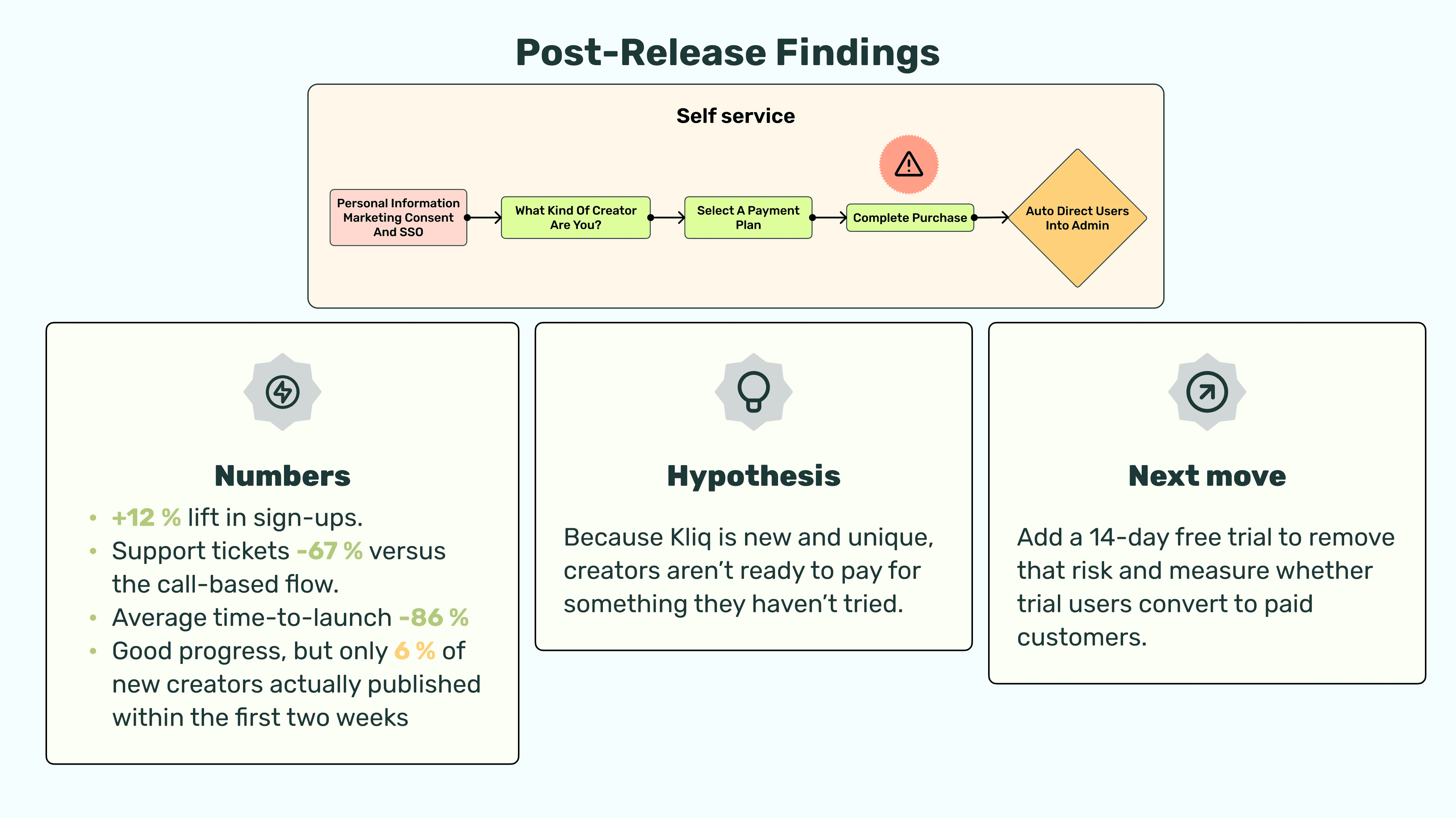
Release 2: a 14-day free trial
We added a free-trial banner to the first screen and deferred payment until the end of the trial. Sign-ups rose by a further nine percentage points, but publishing within 14 days only moved from 6% to 7%, and 68% of trials ended without converting to paid.
The trial eased the worry about price and exposed a deeper problem: creators still weren’t reaching the moment inside Admin when the product clicked for them. That gave the next loop its questions. Were we attracting the right creators? Which step in Admin was stopping them from publishing? And was the product as good a fit for creators as we thought?
Release 3: less to fill in, a clearer path to Publish
Our hypothesis was that the plan and card screen still put people off, even with a trial. We took plan selection and payment out of sign-up altogether, so self-serve became a single page: email or one-click sign-in, a 14-day trial and into Admin in under 30 seconds.
A short, skippable quiz then asked how soon creators wanted to launch, which platform they needed and what their first module would be. We redesigned Admin Home around a three-item checklist with a live preview: create a first module, add a logo and colours, connect Stripe. Publish lit up when all three were done.
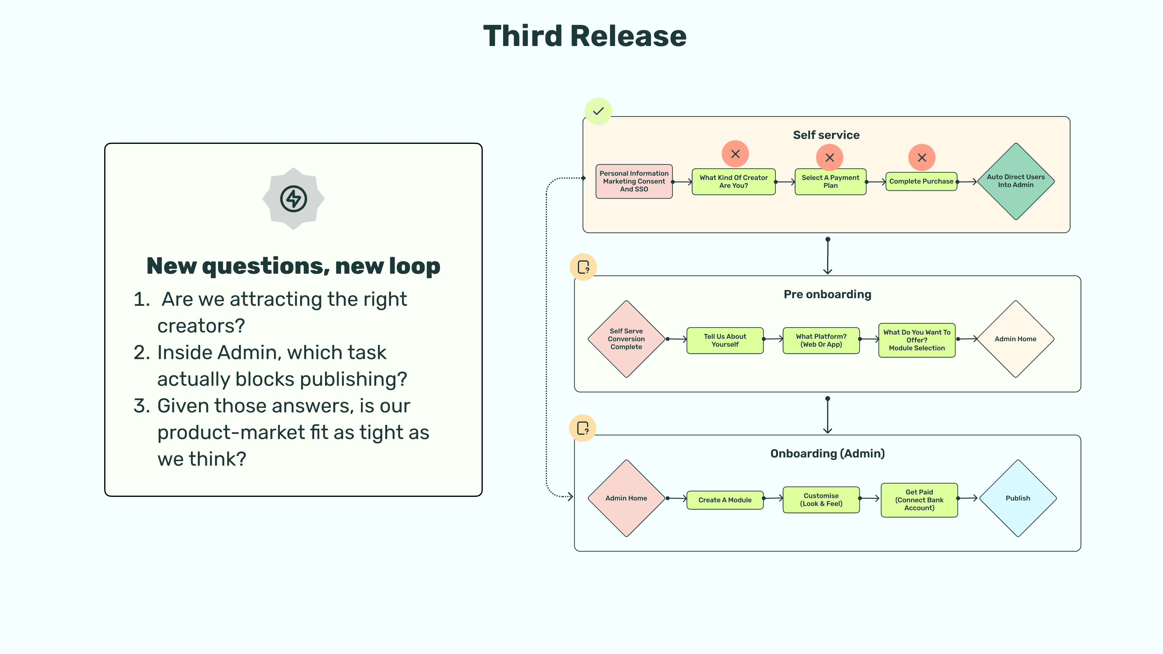
Alongside the routine Maze checks, eight moderated Hotjar sessions with think-aloud commentary informed this release. Without the price step, sign-up felt safer and every participant finished it. Seventy per cent answered the quiz and the rest skipped it without losing momentum. All of them understood the checklist and stopped searching the side menus.
After the final release, the team reported 29% more sign-ups than the original call-based journey. Publishing within 14 days reached 11%, up from 6% after the first release, and day-one support tickets fell by a further 40%.
Outcome
From a booking link to a self-serve funnel
Over three releases, the team replaced the mandatory call with a self-serve route. The results it reported:
Sign-ups: 29% higher than the original call-based journey, the team’s final reported result
Publishing within 14 days: 11%, up from 6% after the first release
Support tickets: down 67% compared with the call-based journey after the first release, with day-one tickets falling a further 40% after the final release
The first release proved creators could reach Admin without help, and the trial showed that price was not the real blocker. It took the quiz and checklist to get more creators all the way to Publish.
What I would do differently
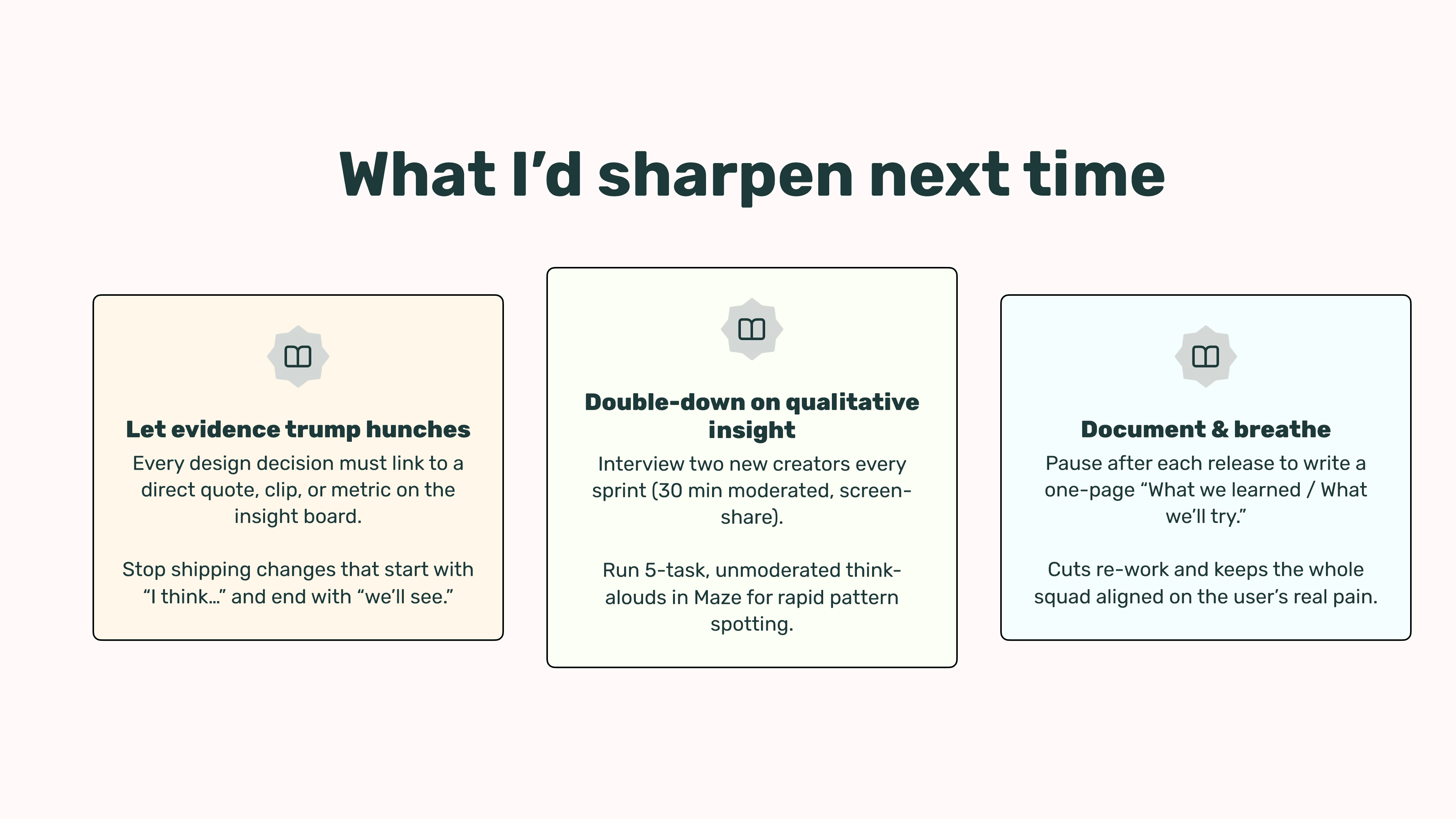
Our analytics showed where creators dropped off but rarely why. If I ran these loops again, I would build qualitative research into every sprint: two short moderated interviews with creators from the free-trial list, and unmoderated think-alouds in Maze with voice recording. I would also keep a shared decision log linking each change to a quote, clip or metric, with a one-page note after each release on what we learned and what we would try next. That discipline stops changes that start with “I think” and end with “we’ll see”.