Gallery Delarue
2019
Designing Gallery Delarue’s website around its art and events
Gallery Delarue is an events-led art space. As lead designer, I worked with the owners and their developer to define the brand, prioritise a first release and design a coherent website.

Brief
An events-led gallery that needed a stronger online presence
Gallery Delarue is a lively art space that runs exhibitions, workshops and events. In 2019 I led the redesign of its online presence. The goals were a better online experience for its audience and more revenue.
Several things were holding it back. Event bookings went through third-party services, so revenue that could have stayed with the gallery went elsewhere. It also needed more compelling content, stronger merchandise sales and closer engagement with the people who came to its events.
I was the lead designer, covering product design and brand repositioning. I ran the discovery work with the owners, defined the site’s structure and interface, and worked with the gallery’s co-founder, who also built the site, through testing and launch.
Identity
Agreeing what the gallery stands for
I started with detailed conversations with the owners, followed by a three-day workshop on the gallery’s identity, its community and where they wanted it to go.
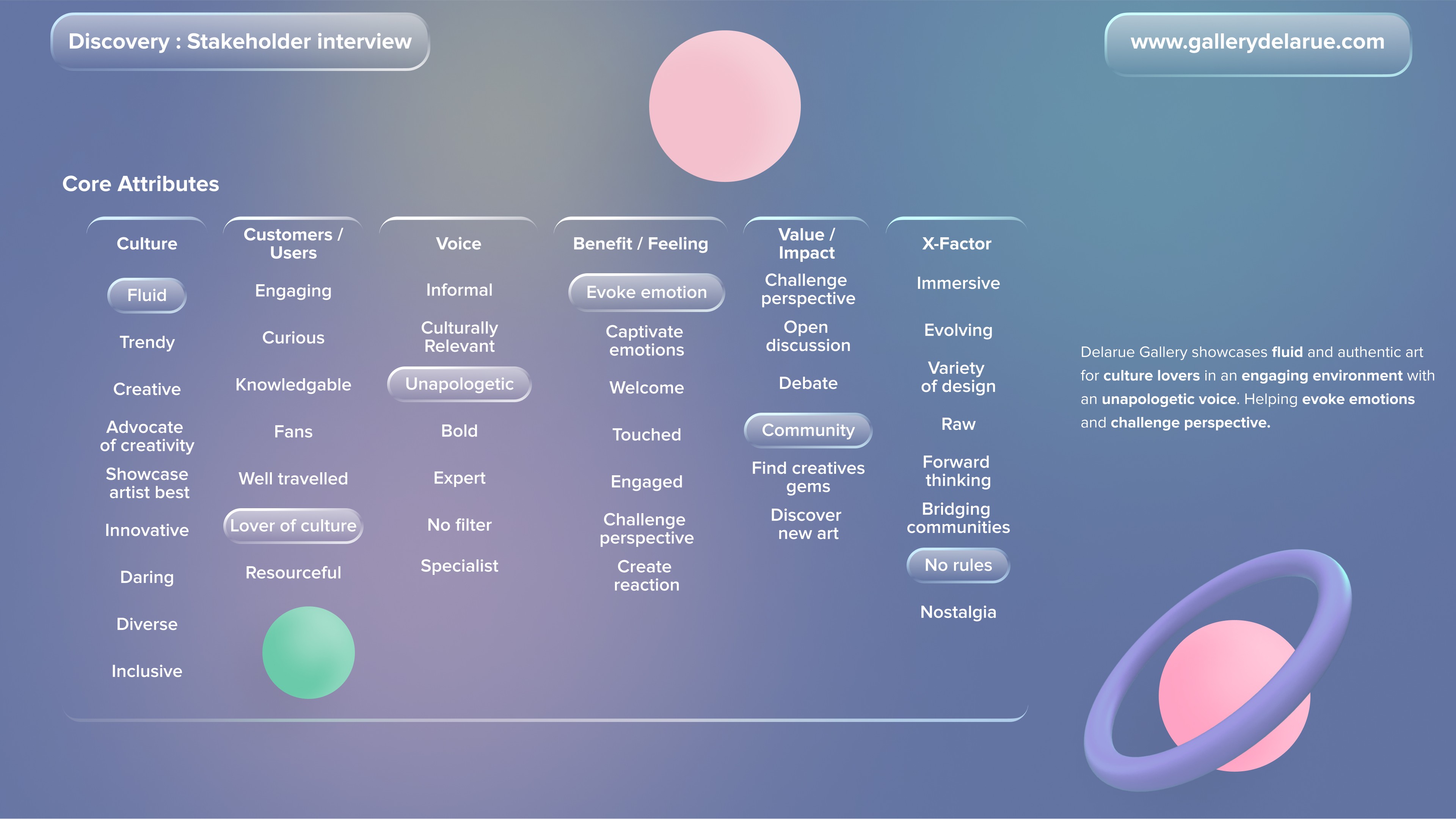
Together we chose the words that describe it: an ever-evolving culture, an audience devoted to art, a bold and distinct voice, a community at its heart and a willingness to be different. We then wrote one statement to guide every later decision:
“Gallery Delarue showcases fluid and authentic art for culture lovers in an engaging environment with an unapologetic voice, helping evoke emotions and challenge perspectives.”
Priorities
Deciding what to build first
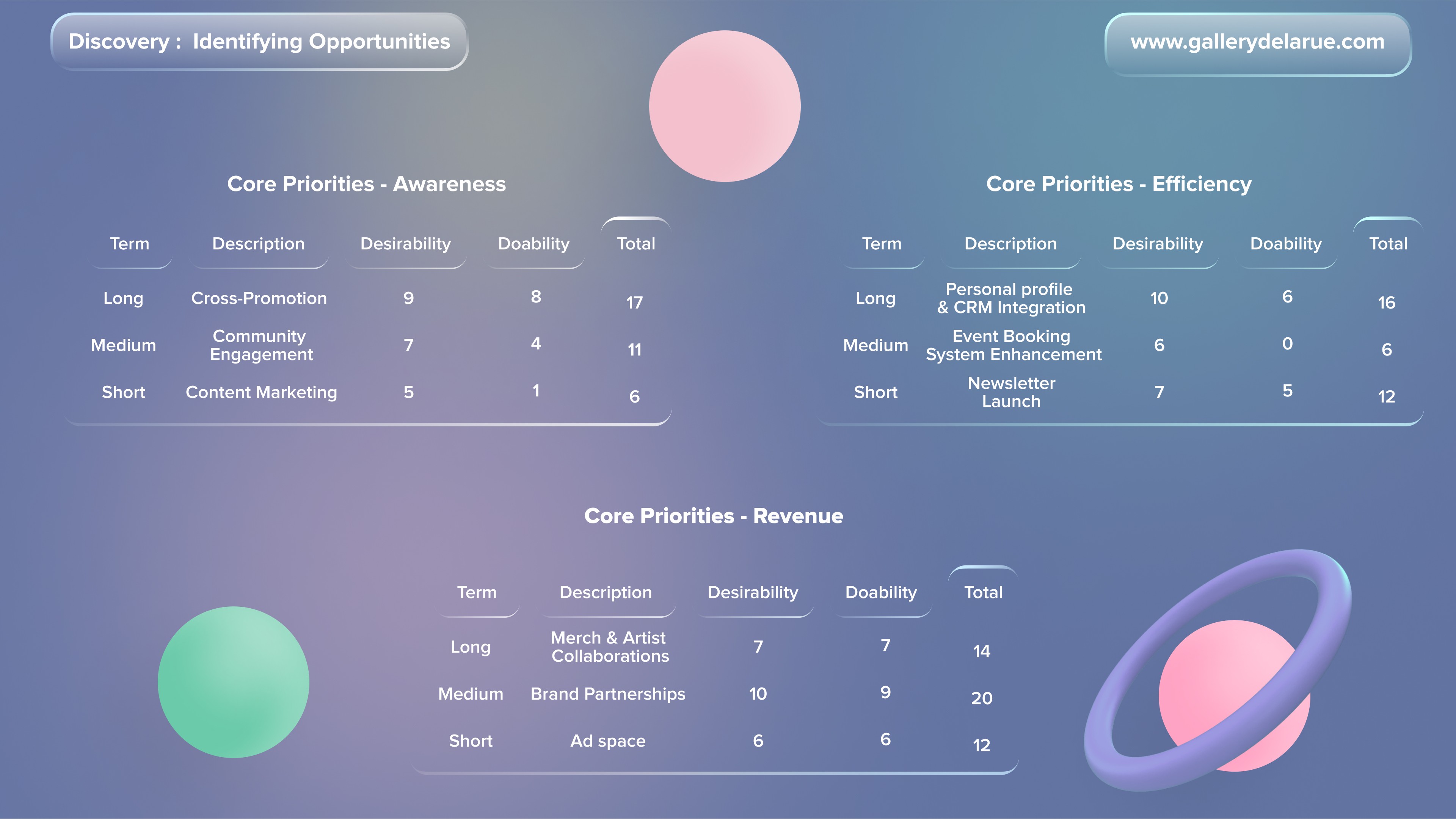
With the identity agreed, we mapped opportunities under three goals: raising awareness, improving efficiency and growing revenue. Each idea sat on a short-, medium- or long-term horizon and was scored for how much the gallery wanted it and how achievable it was.
The scoring separated what belonged in the first version of the site from the longer-term roadmap. The site design centred on the homepage, editorial content, events with booking on the site, and the shop. Member profiles linked to a CRM, brand partnerships, merchandise made with artists, advertising space and virtual events stayed on the roadmap as future opportunities.
Where competitors left room
We compared Gallery Delarue with five art platforms and galleries, including Artsy, Dulwich Picture Gallery and Artfinder, across exhibitions, community, editorial, user profiles, online shopping and virtual events. The review suggested that the gallery’s own artist relationships and live events were where it could stand apart, and it fed into the scoring above.

Audience
Designing for artists as well as art lovers
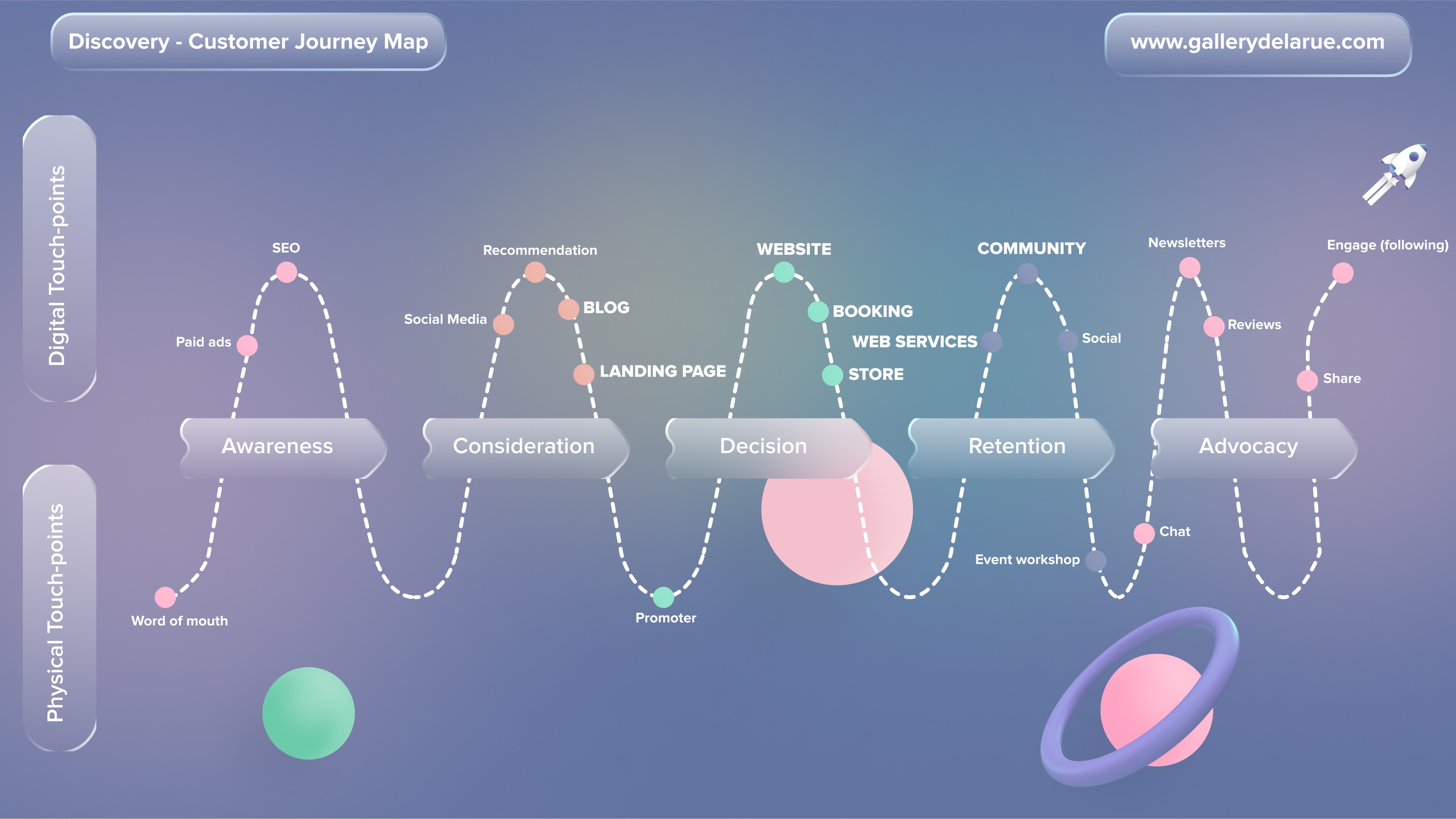
A journey map traced how people discover, choose and come back to the gallery, from word of mouth, search and social media through booking and buying to newsletters, reviews and sharing. At each stage we noted the main challenge, such as getting noticed online, making buying simple and keeping interest between events.
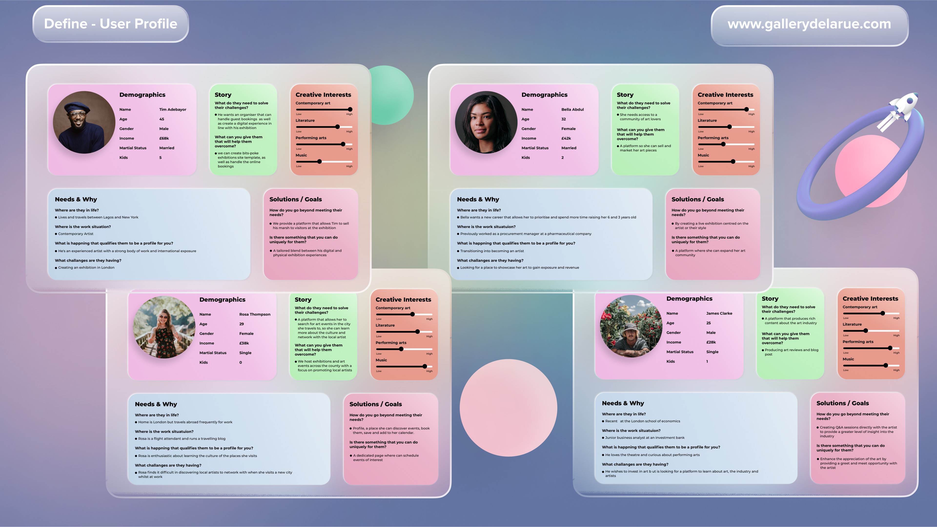
I also created four working audience profiles to explore different needs and journeys. They were working tools rather than research-backed personas:
Tim, 45, an artist working between Lagos and London, who wanted one place to present exhibitions and manage guests on site.
Bella, 32, balancing her art with motherhood, who wanted more exposure and a steadier income from her work.
James, 25, a business analyst who loves art outside work, and wanted to understand the art world, from market trends to buying.
Rosa, 29, a flight attendant who wanted to find what was happening in each city she visited.
The profiles acted as a check during prioritisation. Booking and clear event listings mattered to people like Tim and Rosa, and editorial content to curious visitors like James. Ideas that served several profiles were easier to justify for the first version of the site; they were not a measure of how the real audience divides.
Design
A simple structure that keeps the art in front
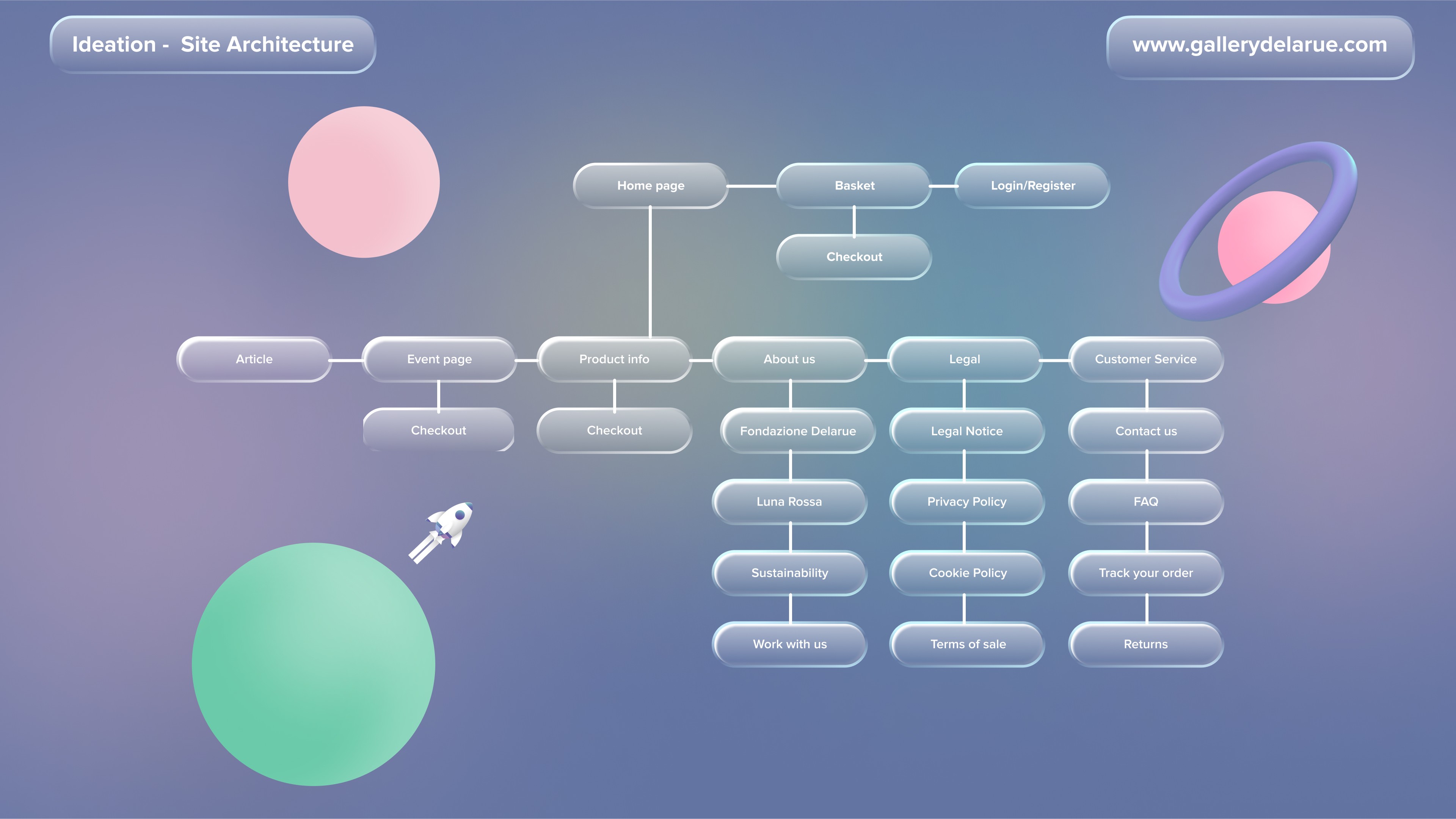
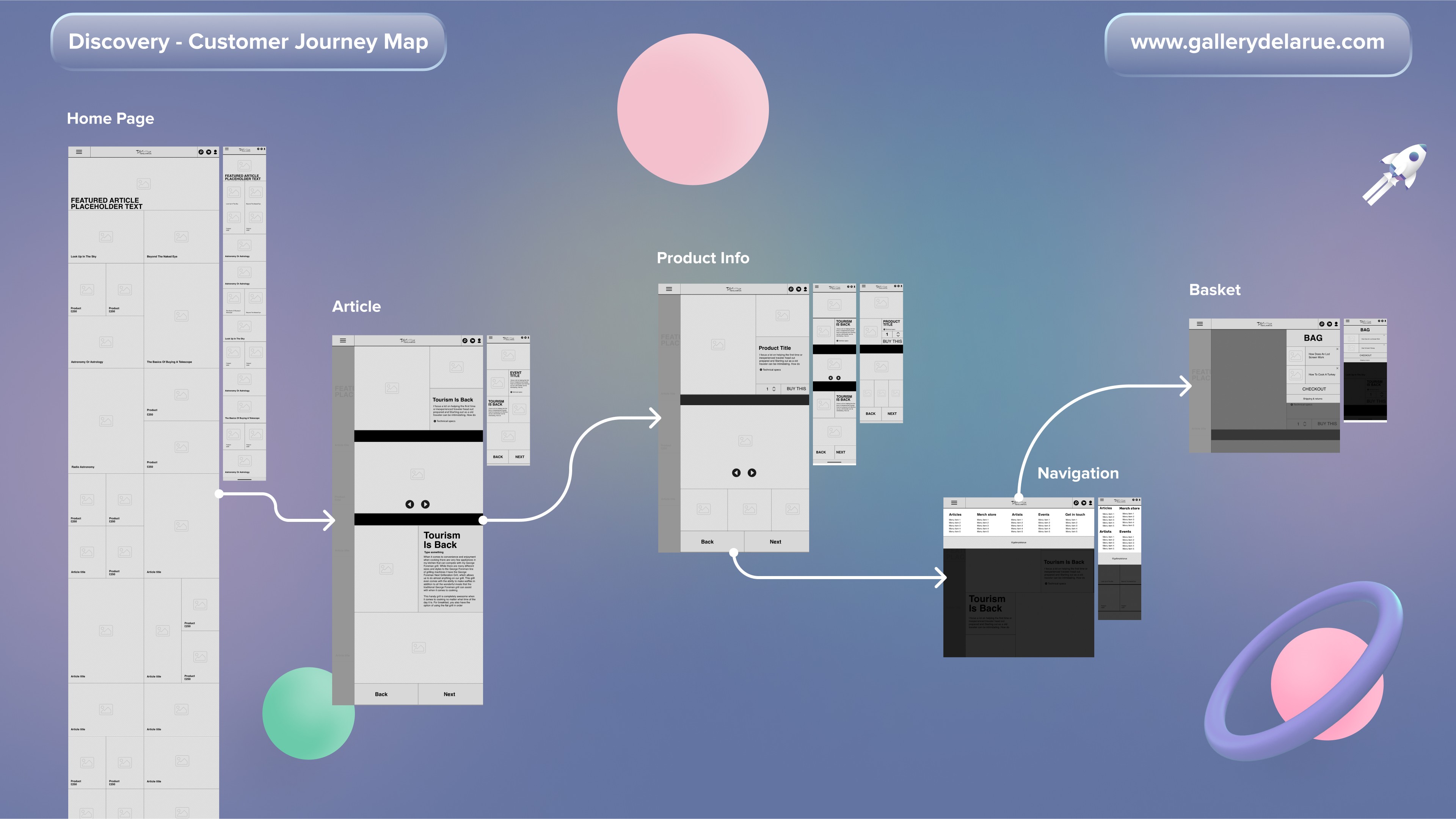
The site has three levels. The homepage brings together merchandise, editorial and upcoming events. The second level goes deeper into whichever artwork or event someone chooses. The third covers the essentials: menu, basket, checkout and login.
Decisions in the design
Event booking was designed into the site itself, so visitors could book without leaving for a third-party service and the gallery could keep that revenue.
There wasn’t enough content at launch to fill separate sections, so we brought every content type together on one page. It was simpler to browse and made what we had easier to find. The content plan included articles, videos and Q&As with artists to give people a reason to come back between events.
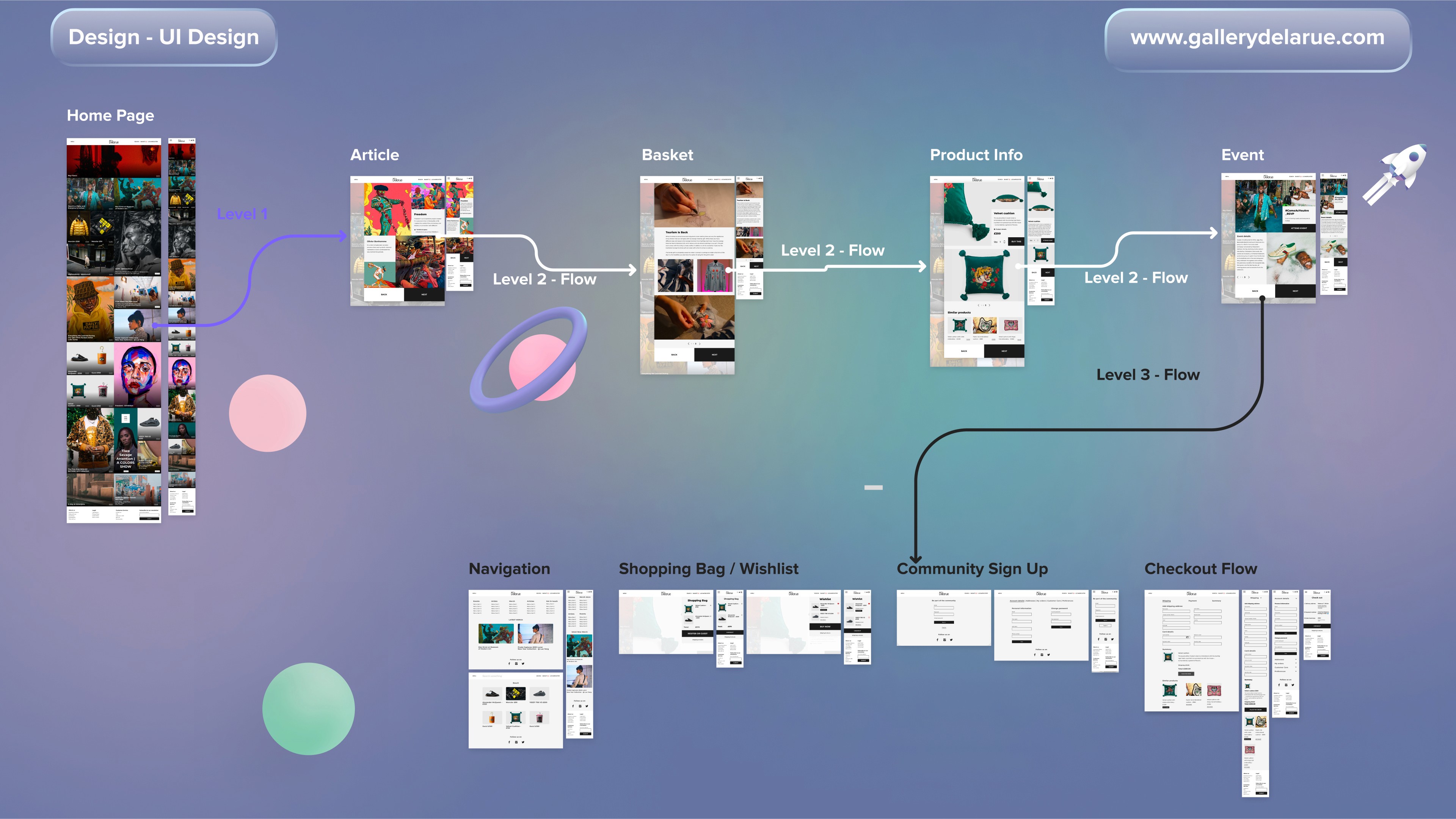
Visually, the homepage is bold and attention-grabbing, while deeper pages follow an atomic design system for consistency. A block-based layout keeps the artwork as the focal point, and Montserrat, a clean, confident sans serif, suits the gallery’s voice. One media component handles still images, GIFs and video, so each work can be shown in the format that suits it.
Launch
Refining the design and launching the site
During design sprints we shared progress in InVision, so the owners and developer could give quick feedback as the work moved. Key screens were reviewed and refined through iteration, comparing earlier and later versions.
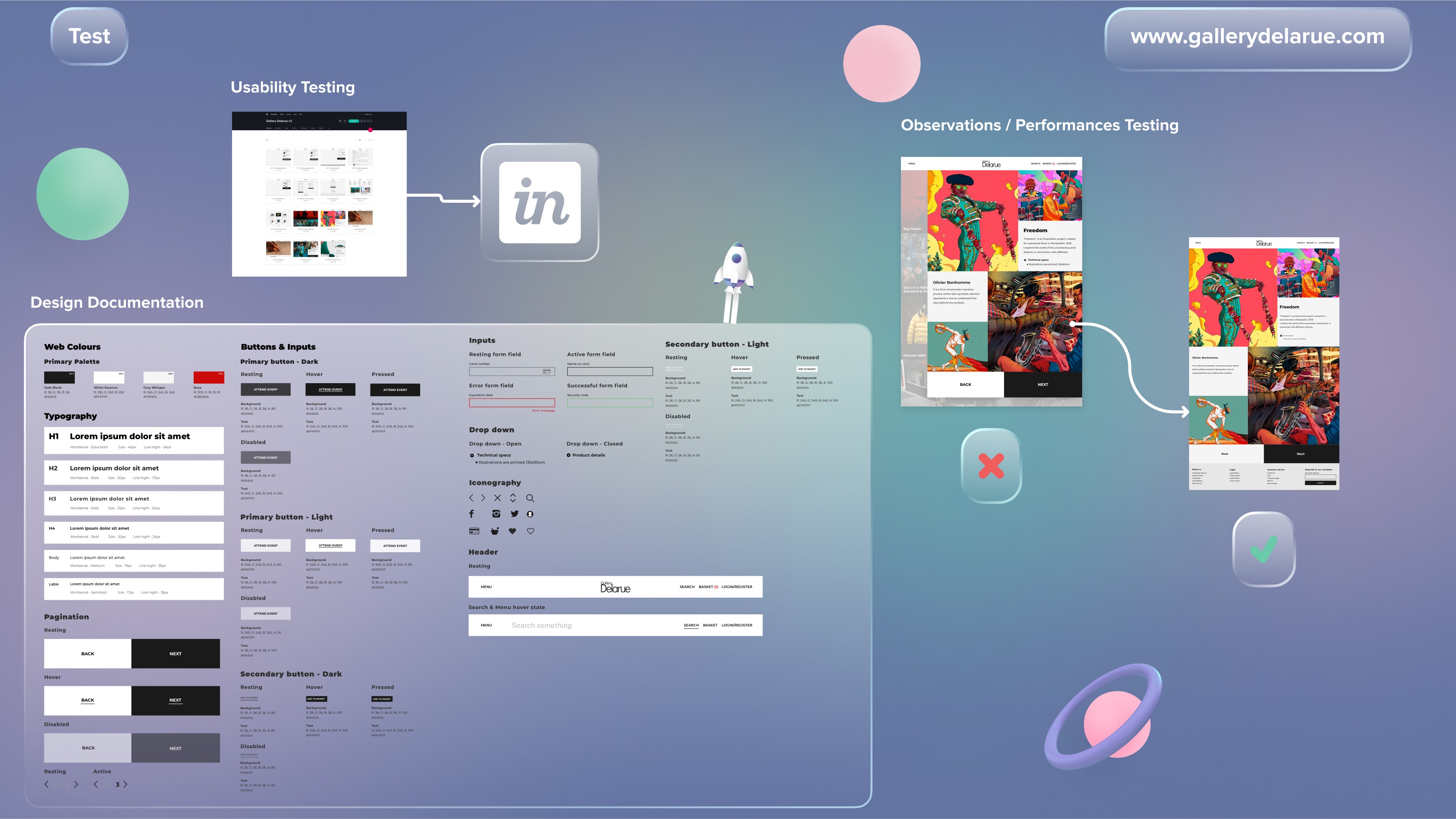
Once the design was final, I wrote a style guide for the developer covering colours, typography and buttons, so the build stayed consistent. During testing we hit a limit: the transparent layered effect we wanted couldn’t be built because of technical constraints, so together we reworked the approach to keep the site clear and visually rich without it.
The website launched. The work behind it gave the gallery a clearer proposition, a prioritised first release, a coherent site structure and a reusable visual system for future pages.
What I learned
Agreeing the brand statement first made later decisions easier to settle. When an idea came up, we could ask whether it fitted the gallery’s voice, served one of the audience profiles and was achievable now. Holding brand, audience needs and business priorities against each other is what separated the first release from the roadmap, and it kept the site from trying to do everything at once.


